Year
2022
Role
Product Designer
Deliverables
Mobile, Web
/ Context
When I joined Macmarts, the main software product had become increasingly fragmented and difficult to use. Developed by a rotating group of engineers without formal design experience, the interface suffered from inconsistent patterns, overlapping functionalities, and confusing navigation paths. Users frequently avoided certain features altogether due to their complexity. Leadership recognised that, to remain competitive in the Resource Management space, the product needed a complete rebuild, prioritising global scalability, accessible design, and modern security architecture from the ground up.
/ Opportunity
Over the following months, I collaborated closely with the Head of Product, Principal Solutions Architect, a React Developer, and a Full Stack Developer to build a new SaaS product from the ground up. Starting fresh with a new React codebase allowed us to eliminate legacy technical debt and implement a modern, scalable UI. By championing a mobile-first design methodology, I ensured the product delivered an accessible, intuitive experience across all devices. This strategy reduced responsive implementation rework by 40% and significantly accelerated our time to market.
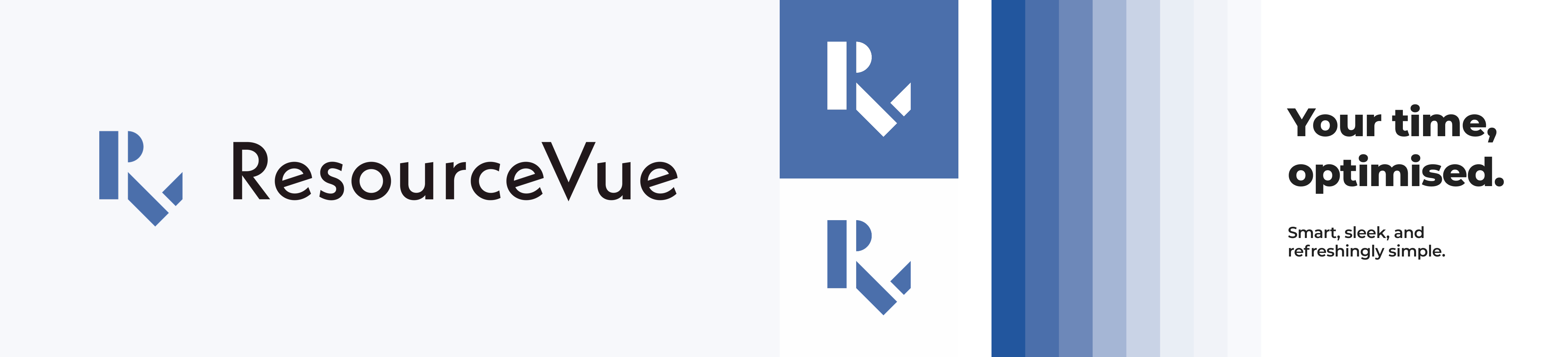
/ Branding
To establish a unified product vision, I orchestrated a series of collaborative whiteboarding sessions that helped align our cross-functional team on core concepts. By creating a space for blue-sky thinking unconstrained by immediate technical limitations, we uncovered recurring themes and values that resonated across disciplines. I synthesised these insights into a cohesive visual identity and brand direction that not only defined our stylistic approach, but also accelerated decision-making throughout subsequent design phases.
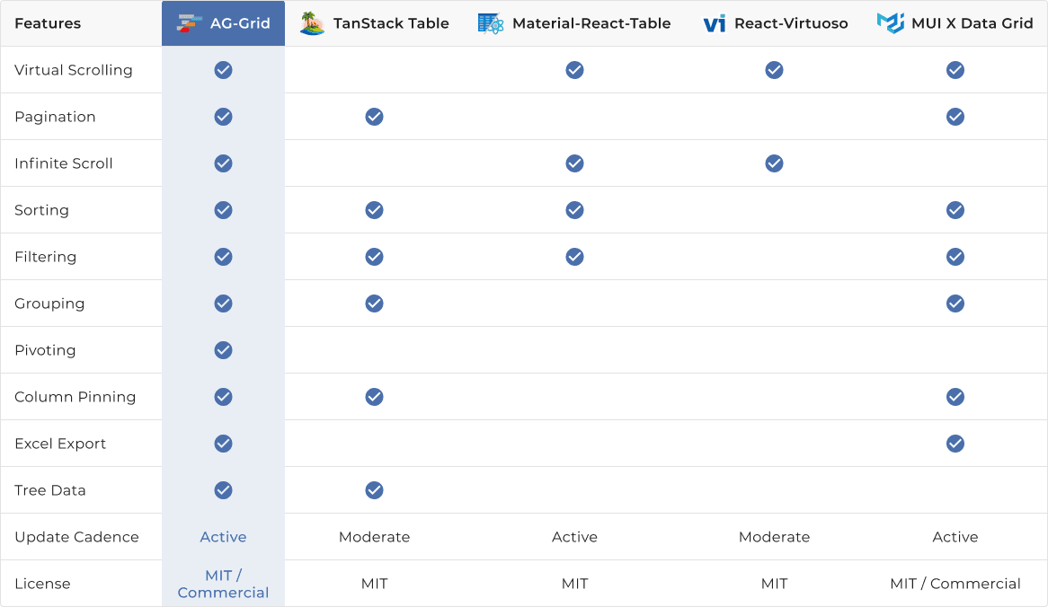
/ Selecting UI Libraries
The selection of appropriate UI frameworks proved critical to our development velocity and product consistency. I led a systematic evaluation of leading UI libraries, establishing clear assessment criteria including component richness, accessibility support, documentation quality, and long-term maintainability. Through close collaboration with our Principal Solutions Architect and React Developer, I recommended implementing Material UI for core interface components and AG-Grid for advanced data table functionality – strategic choices that accelerated our development timetable and ensured a consistent user experience.
/ Building a Component Library
With our UI Framework established, I built a core component library that served as the single source of truth for both the designer and developer teams. By implementing meticulous naming conventions, accessibility standards, and interactive states for each element, I created a system that scaled efficiently with the product's growth. This systematic approach to component documentation reduced design-to-development handoff questions by 50% and virtually eliminated inconsistencies in the implemented interface.
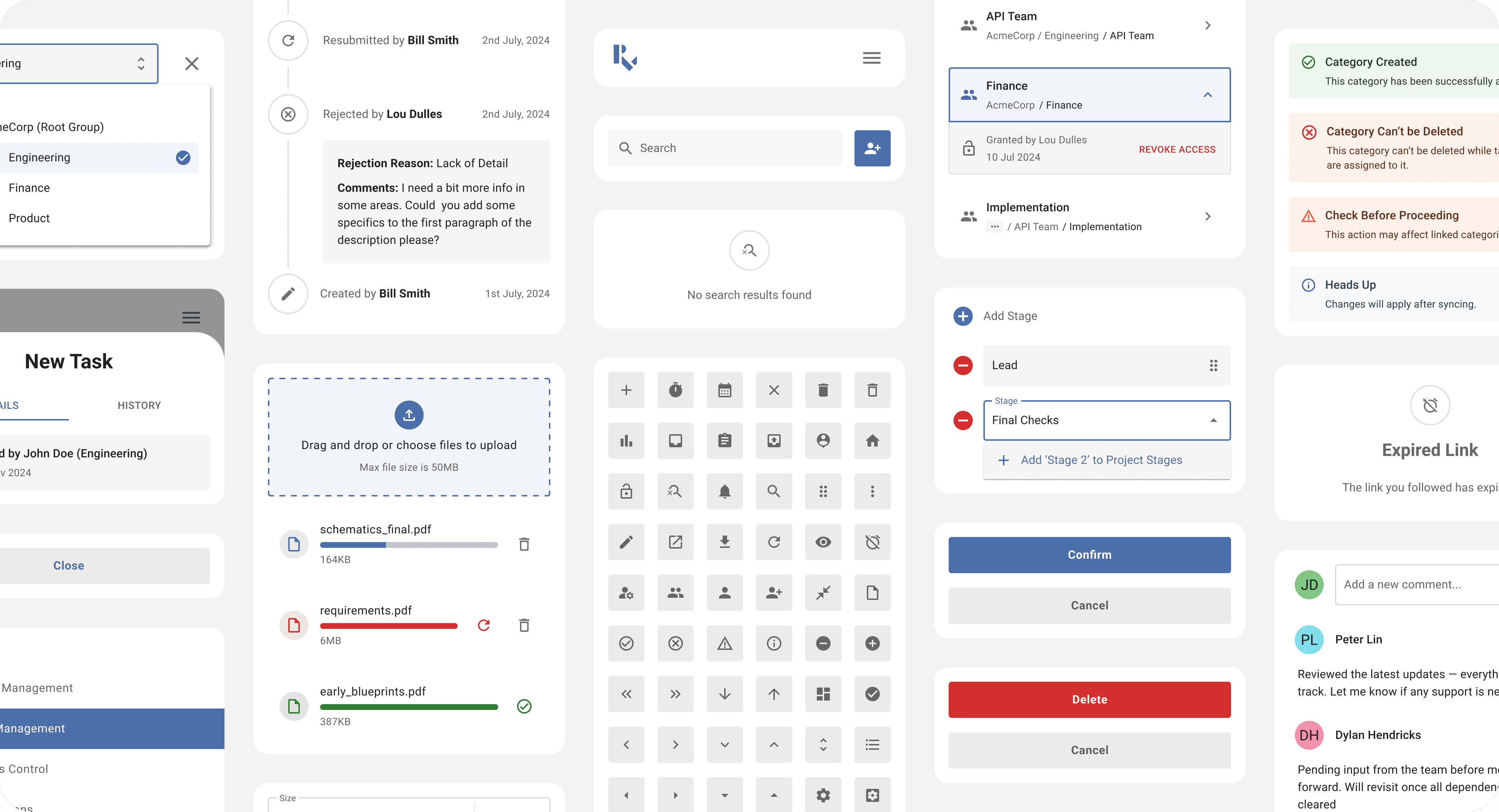
/ Onboarding & Account Recovery
Recognising that first impressions significantly impact product adoption, I crafted role-specific onboarding and account recovery flows tailored to different user persona and authentication scenarios. User testing validated this approach, demonstrating a 90% completion rate for first-time setup tasks without additional support - a crucial metric for reducing customer support burden and accelerating user activation.
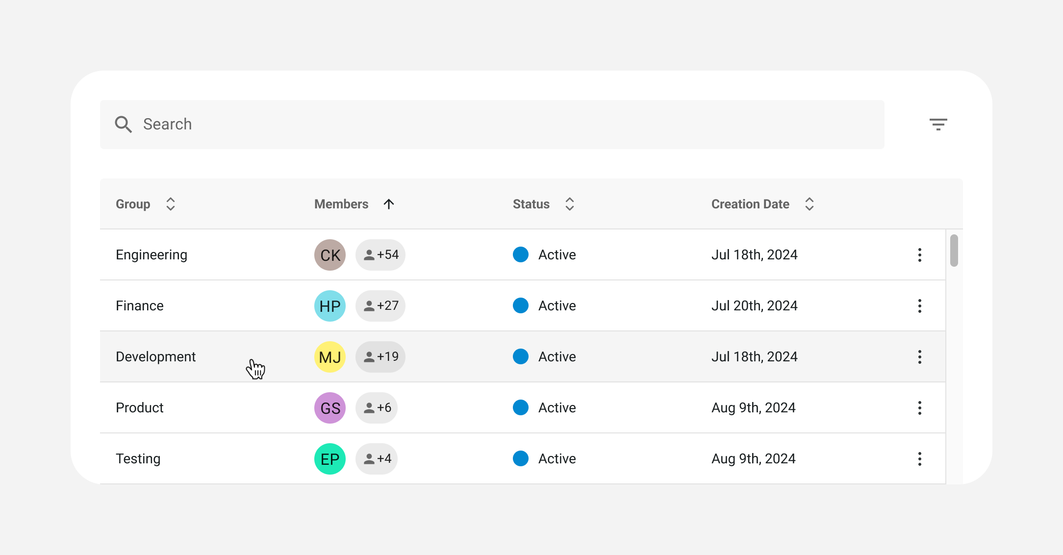
/ Data Grids
Organisational hierarchy management emerged as a core product requirement, making the Group Management page our testbed for the app's first data grid. I designed a flexible grid system capable of handling information-dense datasets while maintaining clarity and usability across device sizes. This design pattern established the foundation for data presentation throughout the application.
/ Modals
To support essential CRUD (Create, Read, Update, Delete) operations, we implemented a unified modal system that accommodated diverse content requirements while preserving consistent interaction patterns. On mobile, ergonomic slide-up modals were optimised for intuitive touch interactions, while on desktop, space-efficient slide-over modals maximised vertical screen real estate. This standardised approach reduced development time for new features by 35% and ensured a cohesive, cross-platform user experience.
/ Group Switcher
To accommodate organisations with complex hierarchical structures, I designed a context-switching mechanism that allows users with multi-group roles to navigate effortlessly between different organisational levels. The solution provides clear visual indicators of the active context while maintaining appropriate permission boundaries and relevant data views. User testing confirmed the effectiveness of this approach, revealing a 70% reduction in context-switching errors compared to the previous implementation - a critical improvement for managers in particular.
/ Outcomes
85% of users rated the product as a "significant improvement" over their organisation’s previous processes
Resource allocation tasks were completed 30% faster, translating to measurable productivity gains
Two major enterprise clients successfully onboarded, validating our approach to complex organizational structures
The design system I established continues to accelerate feature development, enabling consistent iteration without accumulating design debt